
History of Altmetric Attention Score
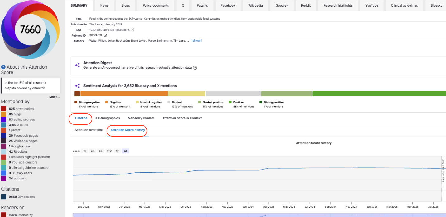
Details Pages include a new way to see how a research output's Altmetric Attention Score has changed over time and see how it got there: whether the score grew steadily, spiked around a specific event, or has stayed flat since it was first recorded.
The Attention Score History chart is available to all Explorer subscribers with access to Details Pages, and to all Altmetric Bookmarklet users. It follows the same access rules as the existing Attention over time chart. If you don't have Explorer access, you'll see a login prompt instead of the chart.
Where can I find it?
The Details Page has a Timeline section with two tabs:
Attention over time: the existing chart showing mentions received over time.
Attention Score history: the new chart showing how the Altmetric Attention Score itself has changed over time.
What can I do with the chart?
Zoom in to a specific period (1 month, 3 months, 6 months, year to date, 1 year, or all time).
Use the navigator bar at the bottom to scroll through the full date range.
Hover over a data point to see the score at that moment.
Export the chart as a PNG image, or download the underlying data as a CSV.
How far back does the data go?
Score history is available from August 2022 onwards, as this is the earliest point we have reliable data for.
Data points between August 2022 and 25 July 2025 are monthly snapshots, and monthly snapshots before 25 July 2025 are only available for outputs that are also tracked in Dimensions.
From 25 July 2025 onwards, data points are daily.
A "?" icon next to the chart explains this in more detail.
What you'll see on the chart depends on the output:
If the output already had a positive score by August 2022, the chart starts in August 2022.
If the output first reached a positive score after August 2022, the chart starts from that point.
If the score has stayed the same since August 2022, the chart shows a flat line.
If the output has no Altmetric Attention Score, no chart is shown.
Frequently asked questions
Why can I see the "Attention over time" chart but not "Attention Score history"? The Attention Score History tab only appears for outputs that have a recorded score. If the score is zero, the tab won't appear.
Why does my chart start later than August 2022? This means the output's first recorded mention or score change happened after August 2022. The chart reflects the actual history available for that output.
Why do some parts of the chart not have tooltips for every date? A tooltip is only generated when a score change is recorded. If the score doesn't change between two dates, the line simply connects the two points, showing a period of stable attention.
The score on the chart doesn't quite match the score shown in the Donut. Which one is correct? Both are correct. They come from data pipelines that refresh at slightly different times, so there can occasionally be a small, temporary difference between the two.
Why has the Altmetric Attention Score for my output gone down? This is expected behaviour in some cases. You can read more about why scores can decrease in this article.
Can I see which sources (news, social media, etc.) contributed to the score at a given point? Not at the moment. The Altmetric Attention Score is a composite measure, so it can't be meaningfully broken down by source on this chart.
Can I add markers for events, like a press release or conference? Not currently. This is something we're exploring for the future, but we don't have a timeline to share yet.
Is this data available through the API or Google BigQuery (GBQ)? Not at this stage. This is consistent with the existing Attention over time chart, whose data is also not available via the API or GBQ.